Using Rank to Compare Homer Motif Enrichments in Different Sets of ATACseq Data
Published:

HOMER is a fantastic tool used, primarily, to discover motifs within functionally annotated stretches of genomic data. These could be (most commonly) from ChIPseq or ATACseq datasets, which align important functional information–either the presence of particular proteins (ChIP) or overall accessibility of chromatin (ATAC)–to specific regions of the genome.
Often we do this sort of analysis to infer potential for binding of particular transcription factors or factor families in a given set of genomic regions based on a statistical enrichment of the known binding motifs (or newly discovered ones).
Today I’m going to share some of my experiences working with the results of HOMER, particuarly when trying to compare enrichments across sets of regions that vary dramatically in sample size.
HOMER background
HOMER enrichment for KNOWN MOTIFS works by first comparing target region sets to background regions as control. These background regions are selected randomly from the genome after matching for GC content of your target set. It then assigns weights for GC content, and other sequence bias (checking for imbalances of 1-mers, 2-mers, and 3-mers) to reduce noise, and ultimately calculates an enrichment p-value for known motif oligos from the HOMER (or JASPR) database using the cumulative binomial distribution, or hypergeometric if you have a small sample size and select the “-h” parameter.
Basically, if any particular oligo occurs in your target set of regions more than is statistically likely compared to random genome background regions then it is given a smaller enrichment score

And it works great!
Since this tool was introduced in 2010 it has been widely used to discover important biologically-relevant motifs in genomic datasets and has been cited over 7000 times as of the time of writing this post…
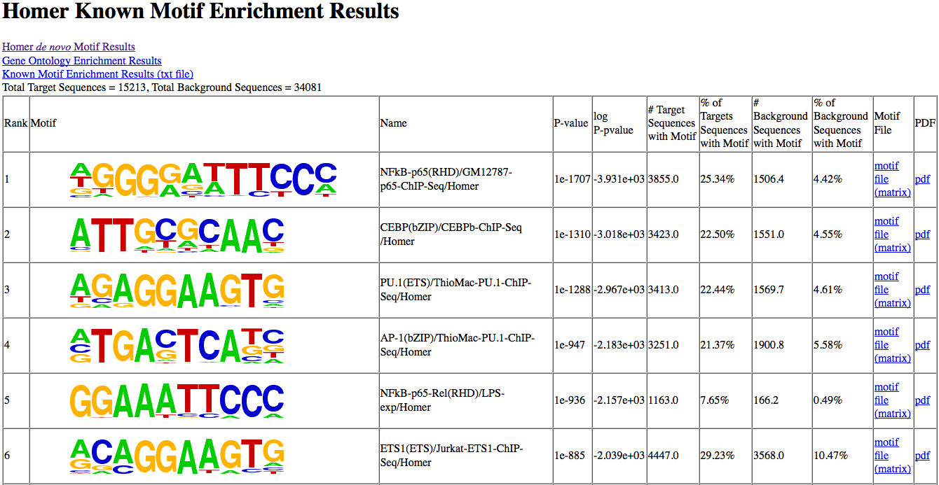
Typically we look at the “most highly enriched” motifs in a particular set of regions, show their postition weight matrix (PWM) logos and move on.
But here’s the rub
“Most Highly Enriched” is by definition dependent on your input
What if I want to compare the “most highly enriched” motifs across different parts of the genome, or different samples?
Sometimes we want to know how the motifs enriched in a certain region of the genome (say enhancer regions near our favorite sets of biologically relevant genes) compare to another set of regions from gene set number 2.
Unfortunately you can’t just take all of the enrichment values and sort them looking for the smallest p-value and call it a day.
This is because p-values depend on power which depends on sample size. Full stop.
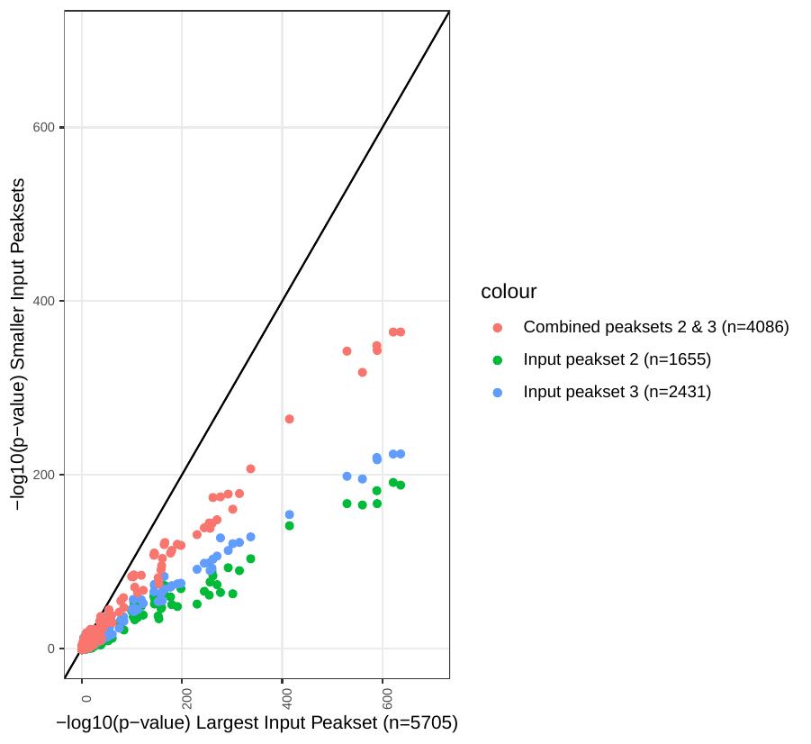
Here’s a look at enrichment values for individual motifs generated by homer using 3 different input peak sets:
Peakset 1: n=1655 regions
Peakset 2: n= 2431 regions
Peakset 3: Peak sets 1 & 2 combined together

It’s pretty clear that there is a bias here generated by the size of the input peak sets! This bias will make it near impossible to compare between different input sets
Ranking Enrichment to the Rescue
But there’s a way around this. Since each test of motif enrichment for a given set of input peaks uses the same number of target and background sequences and is conducted for a finite set of KNOWN motifs in the HOMER database (~400):
The position of each motif in the list of overall enrichments when ranked should help us compared across different input sets
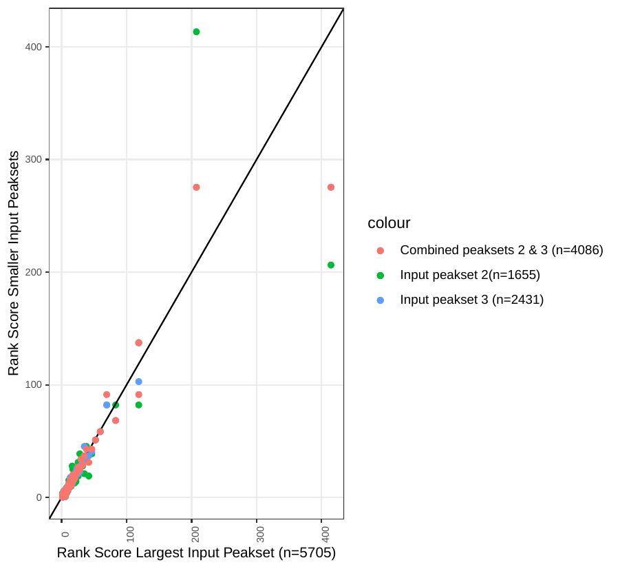
Here’s how the same data from the graph above looks using a rank score in place of p-values. We can now see that the effect of input peakset is less apparent. For this analysis higher rank score indicates higher position on the list of rank p-values

Those which go up or down in rank from one input region sample to the next could be assumed to be found at relatively different enrichment levels…sometimes with biological significance.
What does it mean to be “more enriched”
This is a tricky concept, as we’re running the risk of trying to make comparative statements about test statistics. A big “no no” in the world statistics! But then how do we explain this biologically relevant results?? The best I can say about this is that ranking the enrichments is a loose measure of the extremes of overabundance of particular motifs compared to genomic background. In this way ranking the Homer outputs is a good screen for potentially important motifs and how they may differ between your set of sample inputs.
Coming soon:
I’ll finish writing this blog post showing some of the biological relevance to this approach soon!